Universal Viewer
Case Information
Patient demographics, LIS accession number, and other relevant case details are displayed in the "Case Information" section of the Viewer screen.

Priors Timeline
In the timeline, associated accession numbers for the selected patient are displayed; it also indicates which accession’s image you are currently viewing and if there are images available with any of the prior cases or visits.
You can switch between accessions by clicking on the corresponding box:
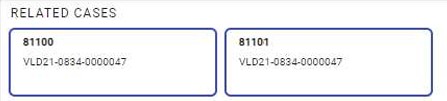
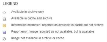
Image indicators:
Slide Tray
The slide tray displays the individual macro images of each slide. It can also display corresponding slide data such as accession, block, slide ID, stain, and tissue type. Under each thumbnail is a row of patented indicator and action buttons which are described below. The indicator icons will be highlighted blue if there was a change or action applied to the image.
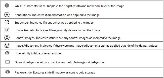
Image Navigation
Navigate through the slide image using the pan and zoom features.
Pan  allows you to move around the image with the mouse, arrow keys, or touch enabled screen.
Rotate controls the rotational orientation of the image up to 360 degrees.

Zoom controls can be used by clicking on the image, mouse scroll wheel, adjusting the slider bar, or using a pinch open on a touch enabled screen or gesture pad; it also indicates which objective magnification level was used during the scan. You can zoom at varying magnifications, up to the originally scanned maximum.

Multi-Image View
You can select multiple slides to view them side-by-side. Locate the Open side-by-side icon  in the slide tray for the desired slide(s).
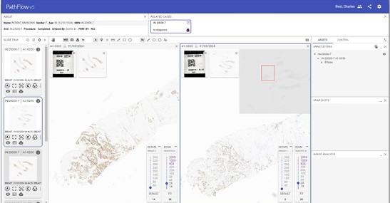
Additionally, you can synchronize the pan and zoom for multiple slides by clicking the Lock icon  above the label image.
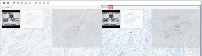
The image with the inactive Lock icon will be the master slide in control of the other images with the active Lock icon. Moving the adjacent slides can provide additional flexibility when aligning the images.
Annotations
There are several annotation tools available in the viewer. These can be accessed via the Annotation Toolbar towards the top of the screen. (WSI = Whole Slide Image, A = Annotations, IA = Image Analysis)

Marker
Using an annotation Marker  , place text and a pointer to highlight features on an image:

Annotation Colors
The color settings for annotations are found in the annotation toolbar. Choosing a color here will set the default color for the annotation tool.

Measure
Using the Ruler tool  , draw measurement lines on the image to get accurate dimensions of areas of interest:
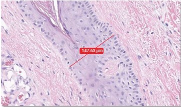
Free Draw
Using the Pen tool  , use any custom shape on the image to draw attention to areas of interest:
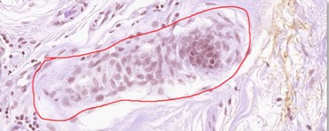
Shapes
Draw Ellipse  and Rectangle
 shapes easily on the image to call attention to specific regions:
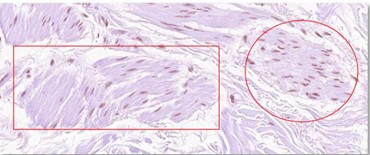
Annotation Tools
After creating annotations, the following tools are available to modify them. The annotations column is found on the right-hand side of the screen:

Edit  the name, description, and color of the annotation.
Delete  individually selected or groups of annotations that you created.
Snapshots
Snapshots are static images that can be saved to the case or downloaded to your computer. To take a snapshot, select the Snapshot tool  and then select the area on the slide you want to capture:
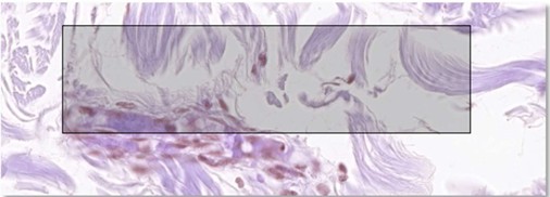
Image Analysis
Digital image analysis provides a quantitative and visual representation of targeted features in the specimen.
Use the right-most annotation tools for image analysis.

Draw a region of interest on the image to be processed.
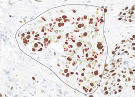
To access the quantitative details, click on the Details icon  in the lower right Image Analysis pane.
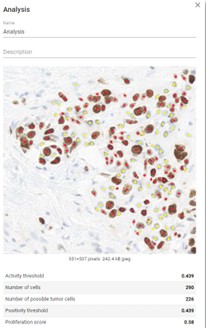
Additional algorithm threshold settings can be accessed by clicking on the image Analysis  icon in the slide tray for the given slide.
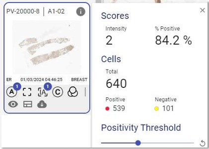
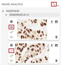
Exporting analysis data is performed by clicking on the Export  icon in the lower right Image Analysis pane. By default, all analysis regions are selected for export. To exclude an analysis region, click on the Eye
 icon next to the region of interest. Properly deselected regions will have the following icon displayed
 .
Settings
The Settings  icon located at the top right of the viewer can be used to configure various viewer tools such as:
- Plugins – Enable or disable viewer plugins such as Label, Thumbnail, Zoom Control, and Navigator.
- Navigation – Modify tracking zoom and navigation thumbnail opacity.
- Rendering – Modify the brightness, contrast, and saturation of an image.
Control Slides
Control slides can be viewed along with the general panel of images within a case. In the viewer, if control slides are present, the control indicator icon in the slide tray on the left will be displayed in blue  .
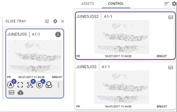
To access the control slides, click on the CONTROL tab on the far right of the viewer. Corresponding control slides will be displayed and accessible here. By clicking on the control slide thumbnail, the control slide will be presented in a side-by-side view with the slide tray image.
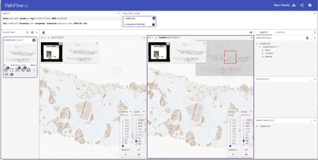
The control slide can be synced, panned, and annotated just like the other images in the panel.
If multiple control slides are present, the user can sort the control slides with the Sort  icon.
The user can have the viewer always open control slides in a side-by-side view when the viewer is first opened by clicking on the cog wheel  adjacent to the sort feature, toggling Split by default and clicking SAVE.
Collaboration
Viewing images in real-time with a colleague is available directly within the viewer via the collaboration application. Note that this feature must be licensed in advance.
Reporting
Review your organization's specific workflow regarding reporting for additional details.